
Independent Exhibit Design Consultancy

Retail Shop
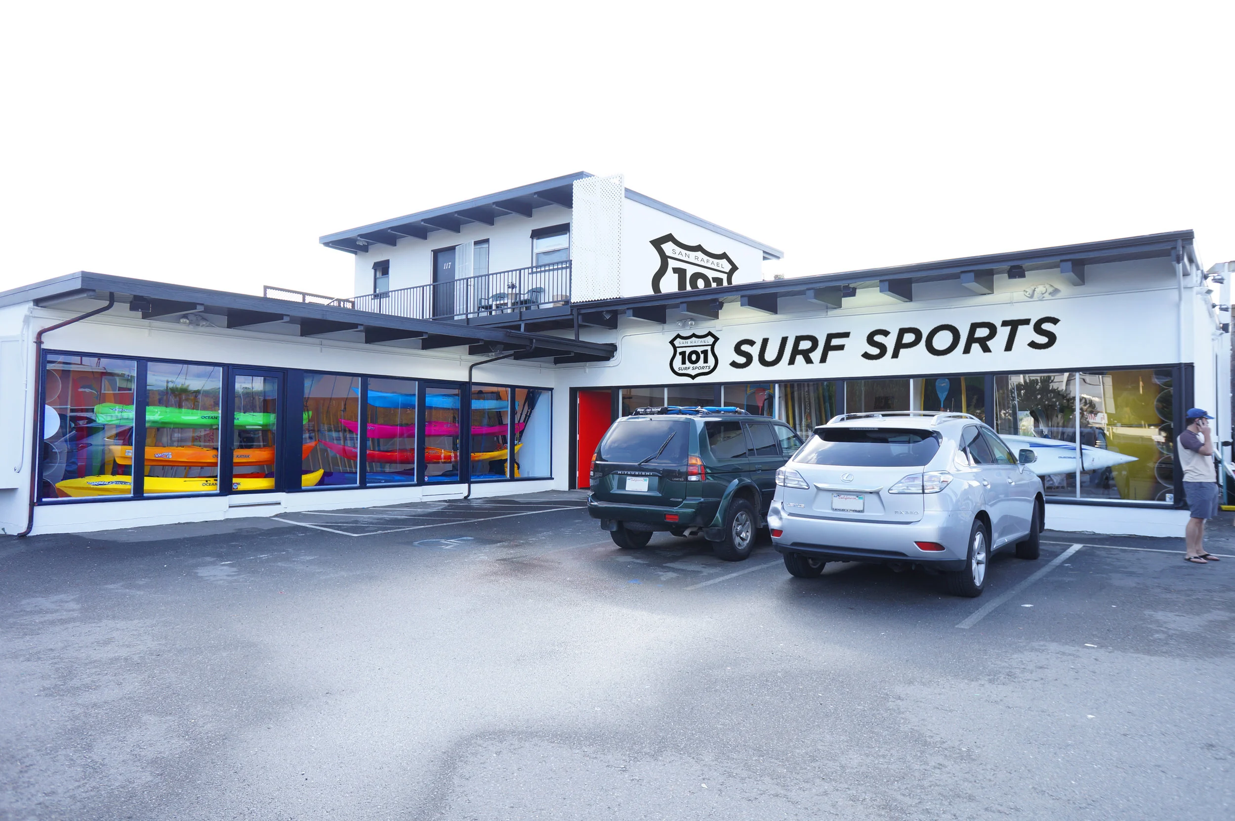
Mauk Design has a history of branding many companies from their origination, but the 101 Surfsports Shop in San Rafael presented an opportunity to design all aspects of the store, from logo, to interior, to vehicles.
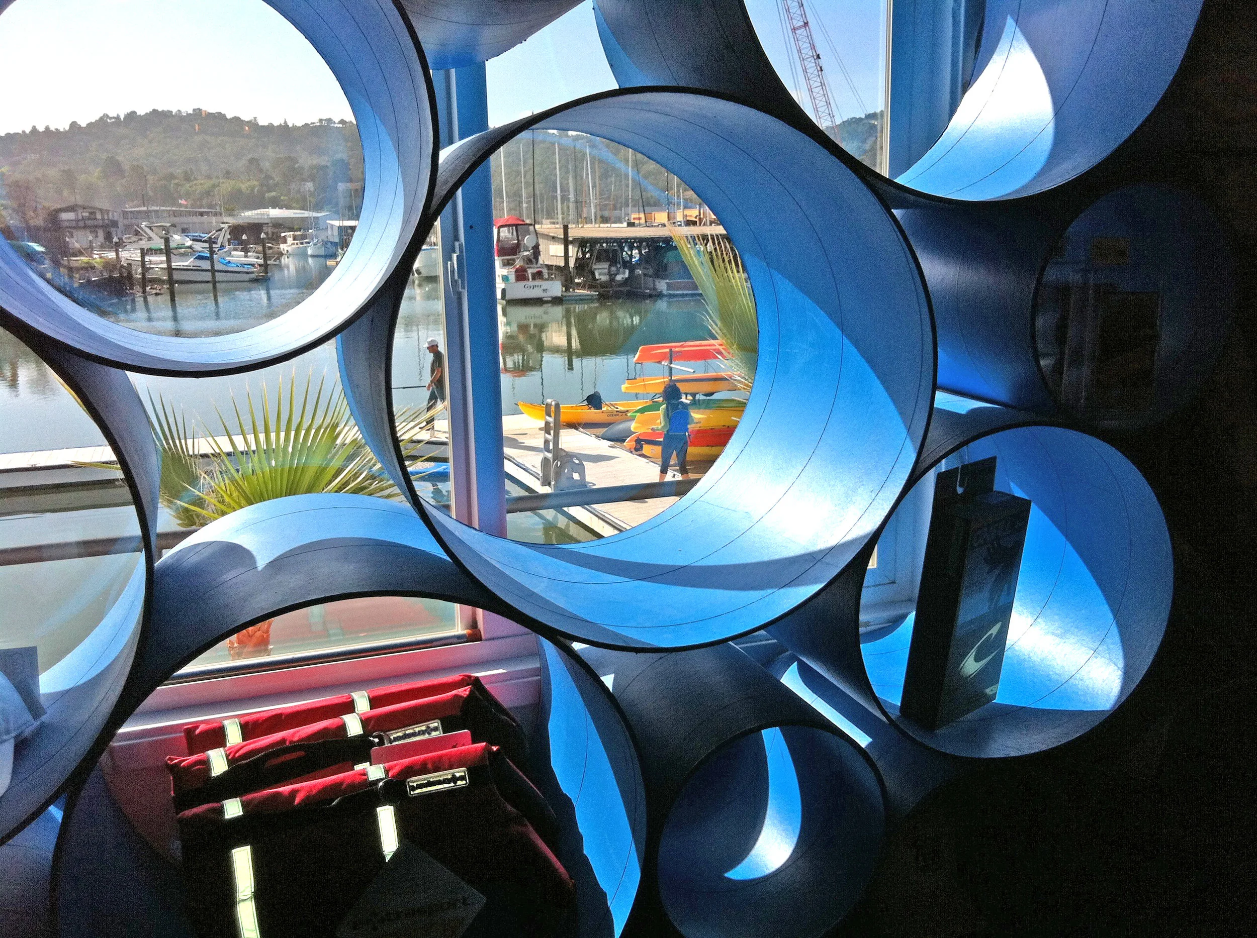
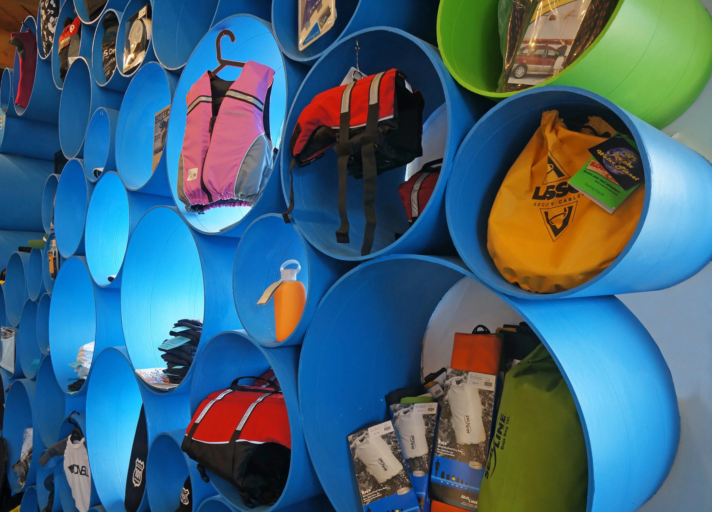
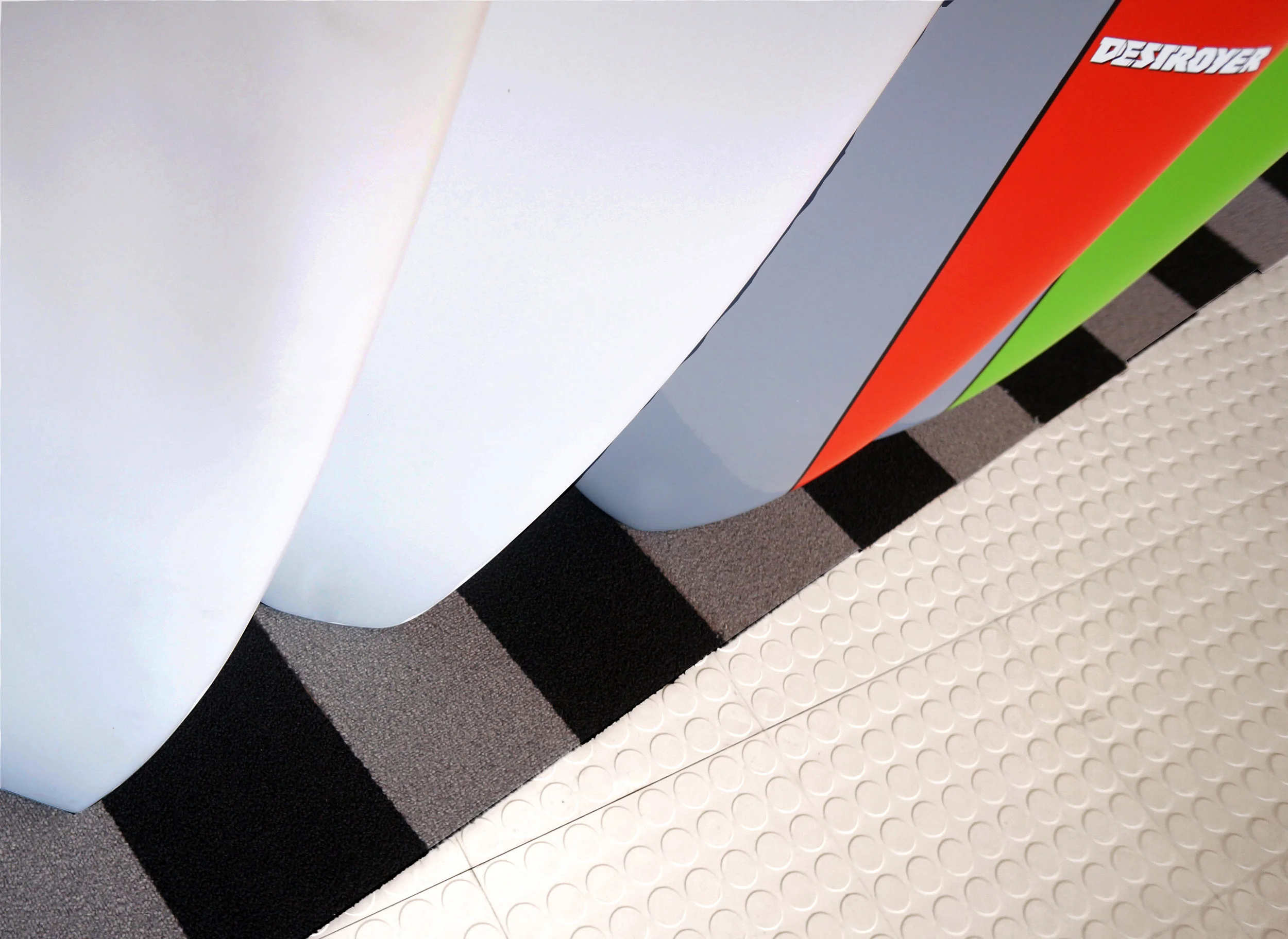
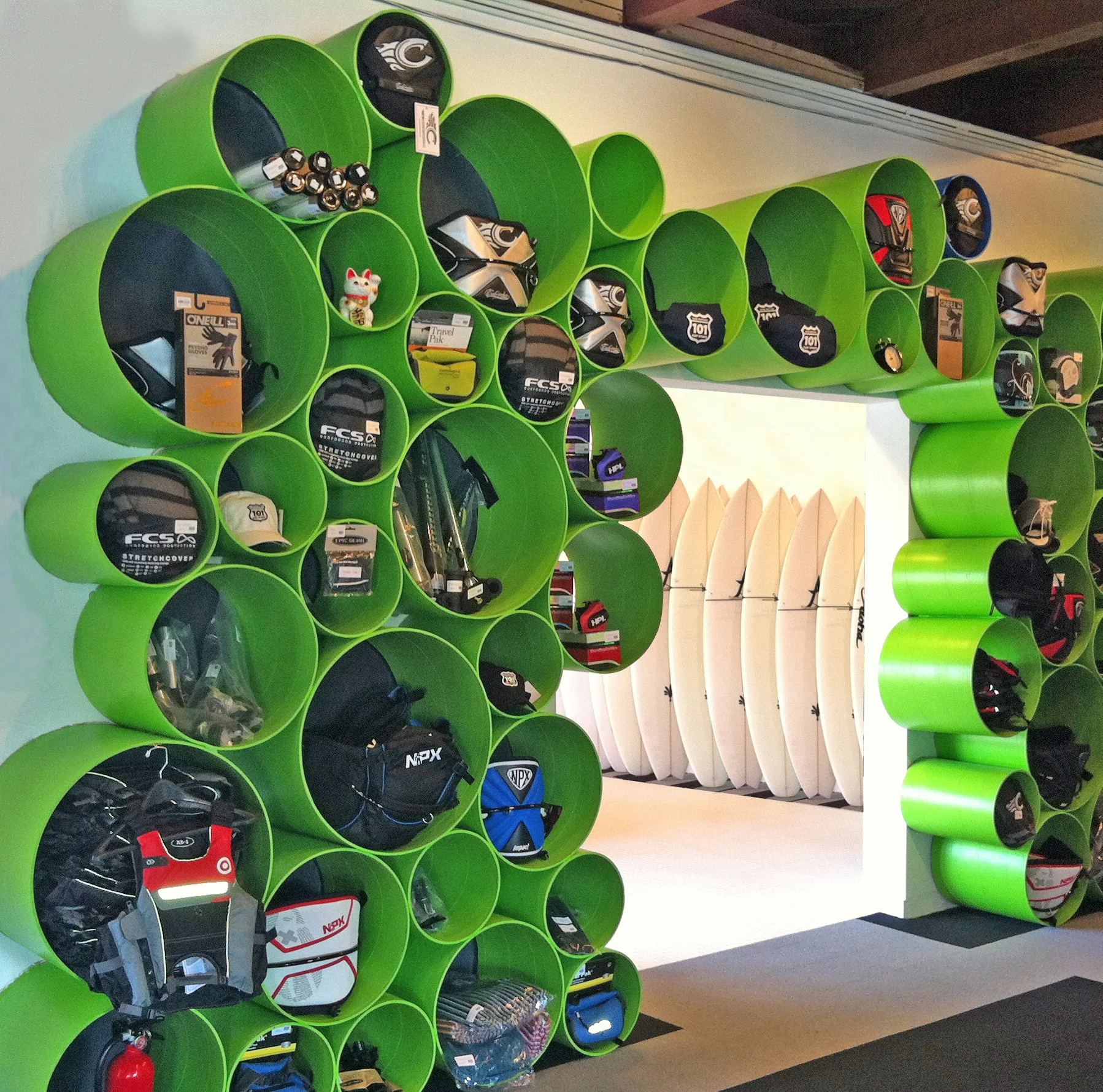
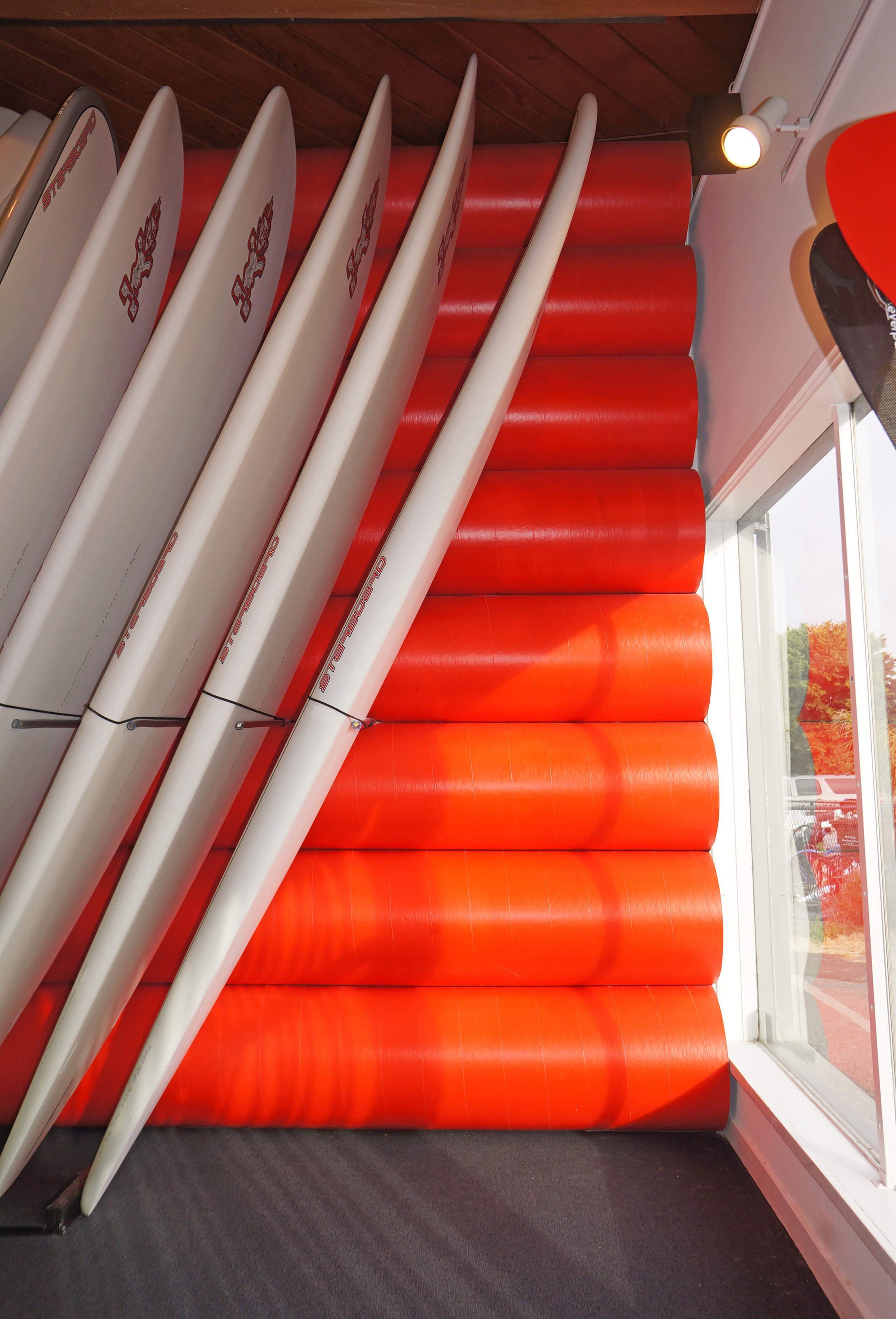
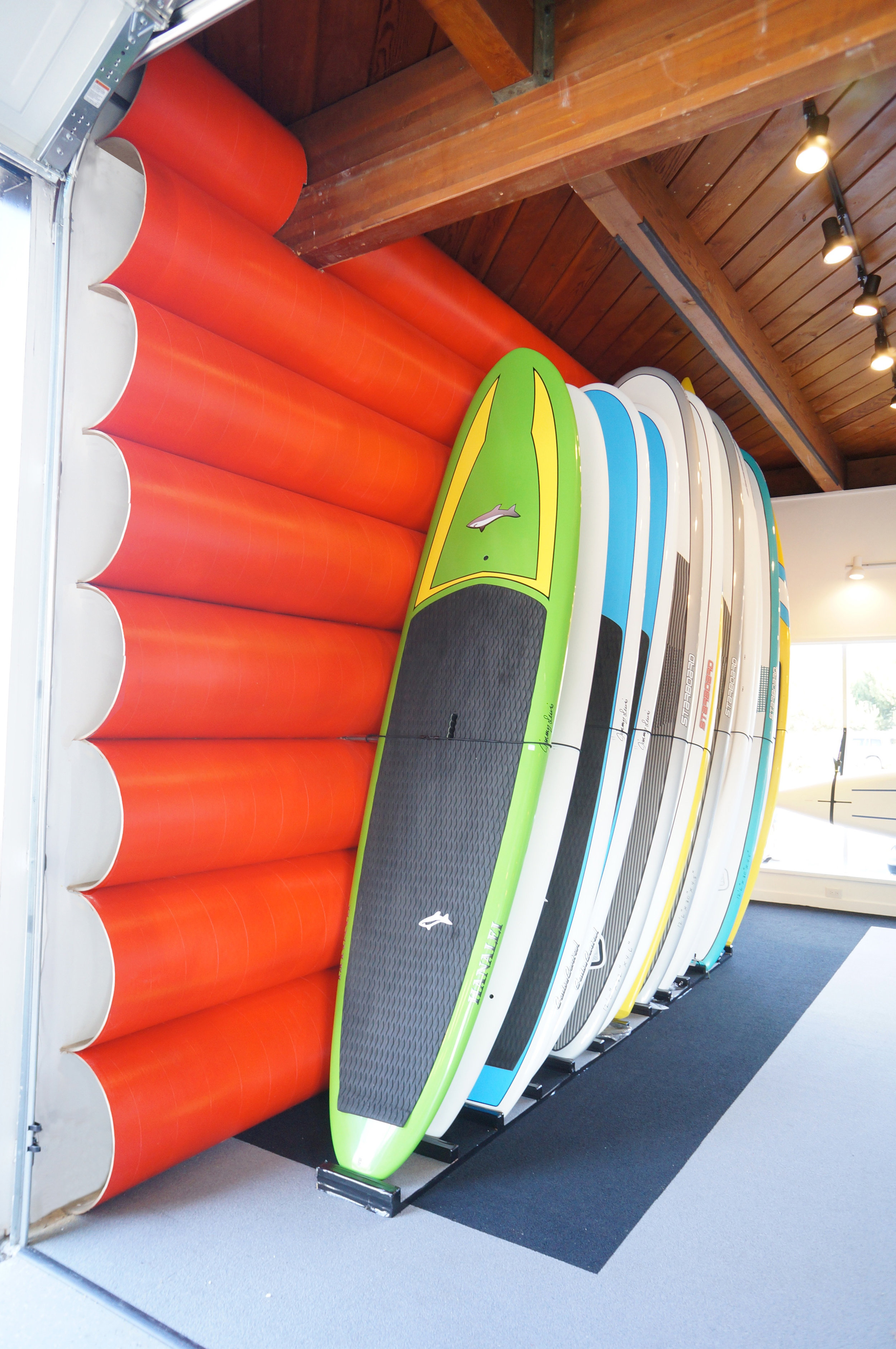
Taking an environmentally friendly stance for a store that is all about enjoying nature through water sports, the use of cardboard tubes became a metaphor for the ocean. A wall of circles with different diameters represents bubbles, and walls of long horizontal tubes to support boards that symbolize waves. The store is designed to show off the bold colors of the products, keeping to a gray scale scheme for everything except the cardboard tubes, which are painted in four bold colors across the store.
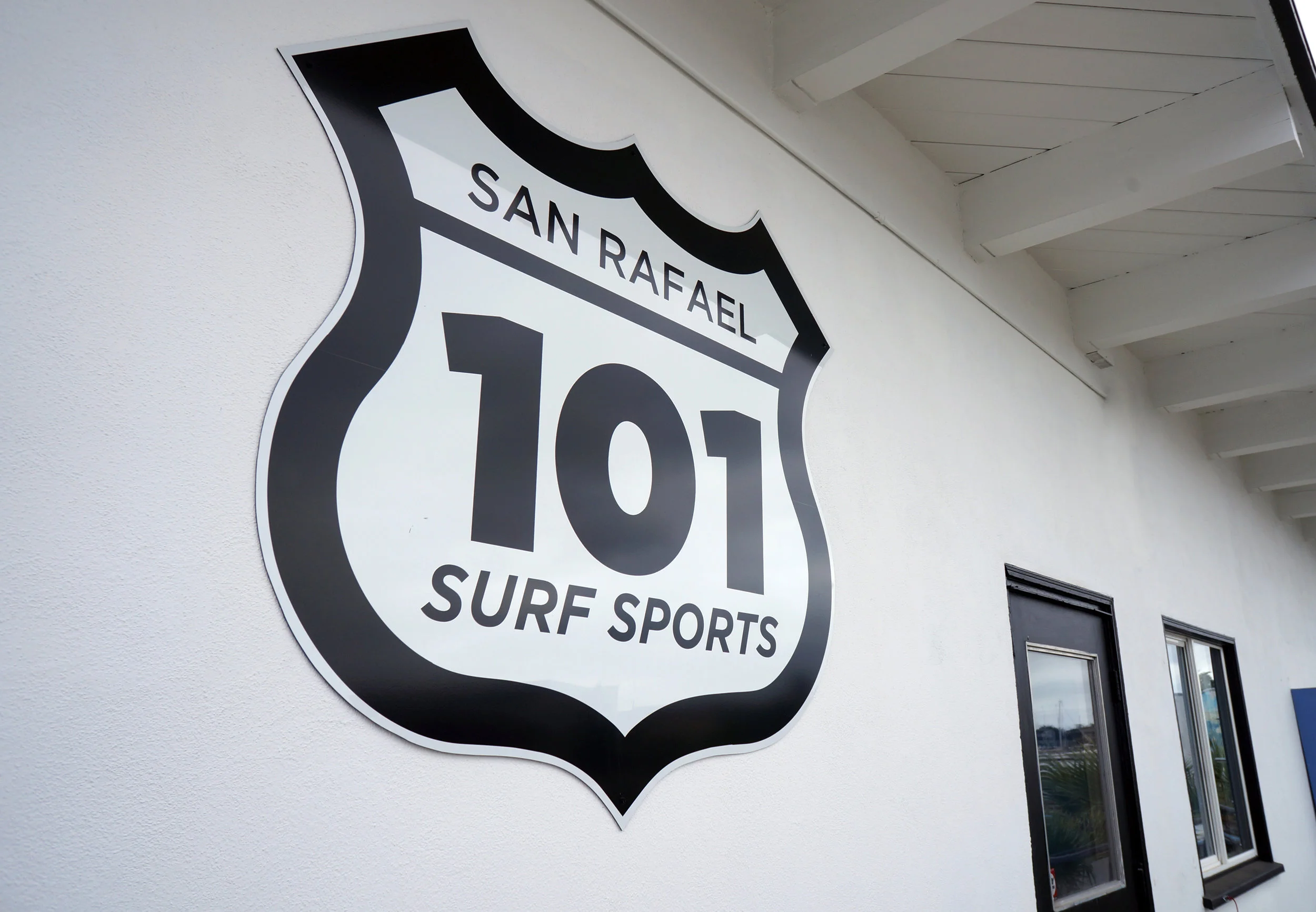
101 Surfsports’ logo is a simplified version of the highway sign that leads customers from the store to the best surf spots of Northern California. The top of the logo forms a scene of waves.