One of the most overlooked tools in an exhibit designers box is color. Walking the convention halls you’ll notice most exhibits are white with blue or red accents. It’s hard to convince an attendee that your product is unique or innovative if your exhibit is the same color as all your competitors. The result is attendee fatigue.
Fortunately there are more than two colors! Start by looking for colors that communicate your message. Environmental message? Try green. Speed? Red’s an option. Tech? Blue can work. Most of these colors come with considerations.
Green in a tech show will be dramatically more visible than a red or blue exhibit, because fewer tech firms have a green message or green corporate colors.
Clover Diary-Popup Store
Some colors need special handling. Bright red tends to die under the sodium halide or mercury vapor lights that illuminate the halls. The solution is to use brightly lit backlit red, which overpowers the hall lights.
Doing a yellow exhibit? It should look as if it has been submerged in yellow paint. Yellow furniture, yellow desks, yellow graphics, yellow everything. Or use black as a background for the yellow color.
McDonald’s World Wide Conference-Operations Exhibit
It’s commonly thought that an exhibit needs to utilize the primary corporate color of the company. Because many corporations share similar corporate colors, this leads to exhibits that blend into their competitors. A better solution is to choose a color that helps communicate the message.
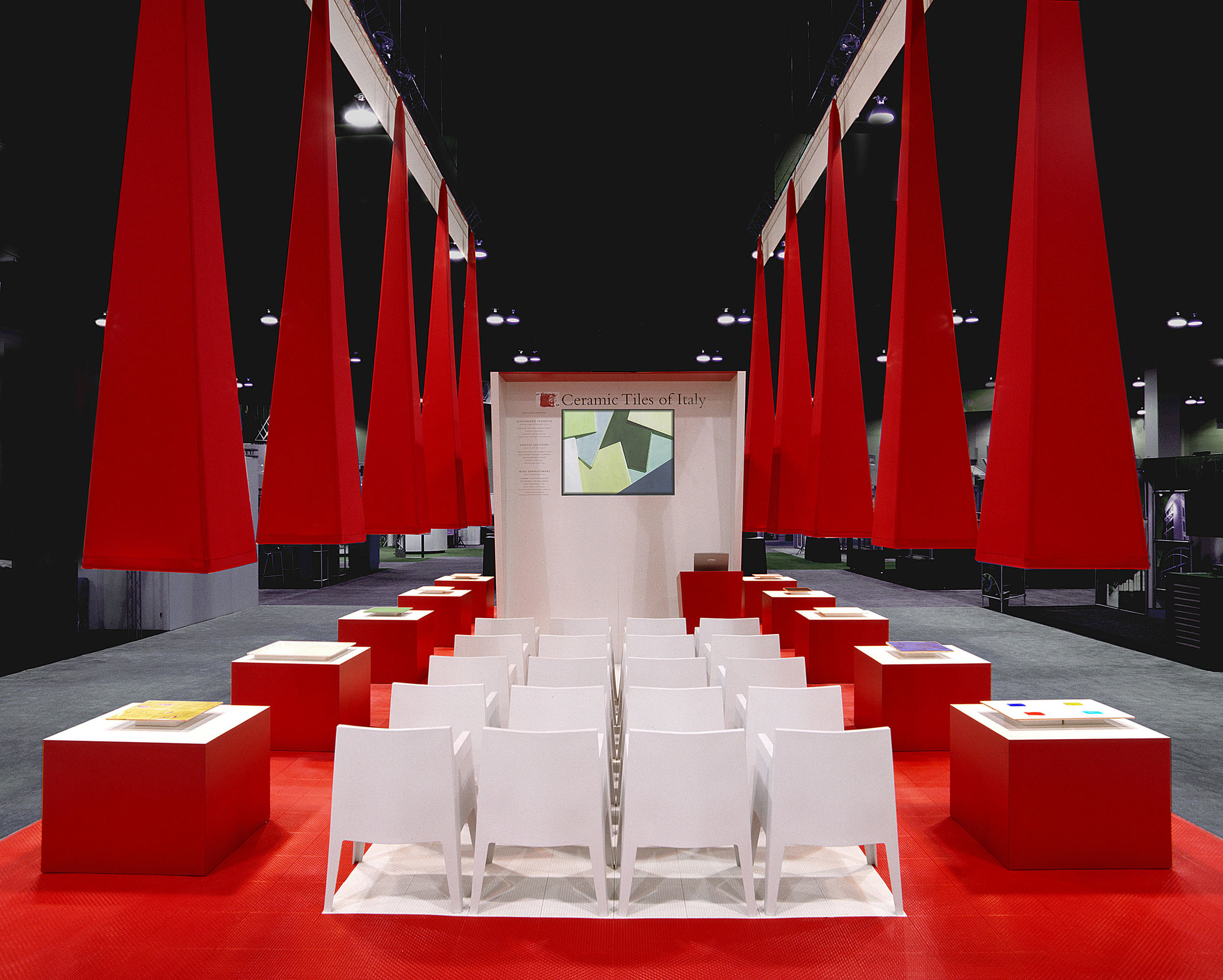
In designing an exhibit for Ceramic Tiles of Italy we presented an entirely red exhibit. They asked “why was it red?” I thought it was obvious, but answered “It’s red like the Italian flag or red like a Ferrari”. Their eyes lit up. “That’s great! Given the fact that most ceramic tile factories in Italy surround the Ferrari factory, it worked. They bleed Ferrari red, and they were ecstatic with the result. More importantly, they were thrilled with their booth traffic.
Ceramic Tiles of Italy-American Institute of Architects Conference
White can stand out in the exhibit space, if done properly. It’s as if you put the clients product on a white backdrop for a photo shoot. The key is to pull all of the clutter out of the design. Only the essential products or communication should be visible. In a white exhibit, even the trashcans are going to call attention to themselves, so they need to be amazing trashcans. As with all exhibits, lighting a white exhibit is even more critical to separating your exhibit from the competition.
McDonald’s World Wide Conference-Futures Exhibit
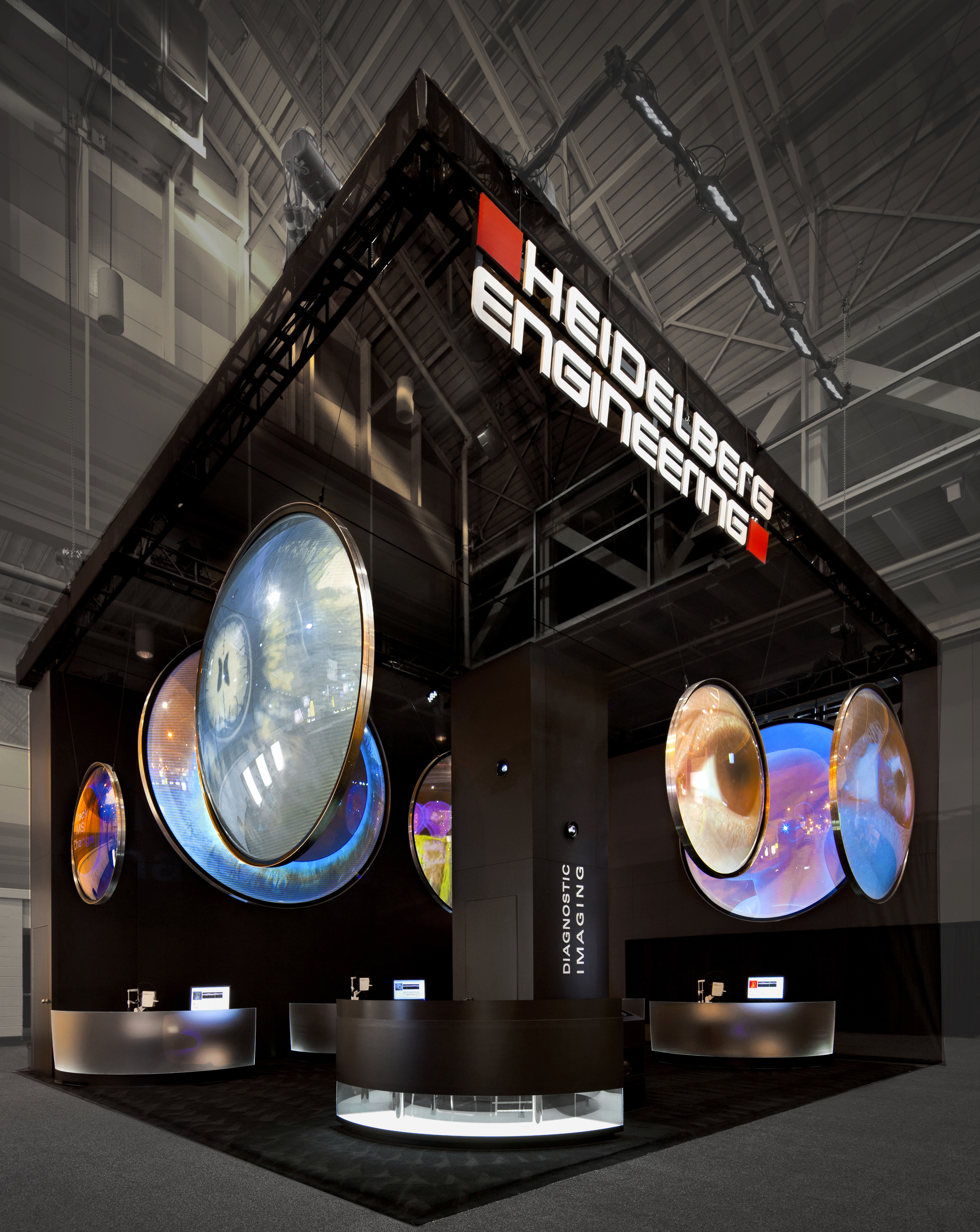
The guidance for a black exhibits is different because the color black absorbs so much light. Lighting an entire black exhibit uses so much light, that it often becomes impractical. It works best when used as an unilluminated backdrop for small illuminated features ( such as type, photos, video screens, etc.). This lets the illuminated features pop against a dramatic dark background.
Heidleberg Engineering Exhibit
Multiple colors require more restraint because they can overpower the message. Again if yo u are making a color statement, let the message guide the design. In this case, the variety of colors reinforced the message of unique approaches to HR management.
McDonald’s World Wide Conference-People Exhibit
The most powerful way to use color is to be thorough in the use of color. Let the color be the star or a background of a single message to draw your customers in.
I look forward to your comments.


